2026-08-21
Warm and cool color contrast for a cinematic AI look
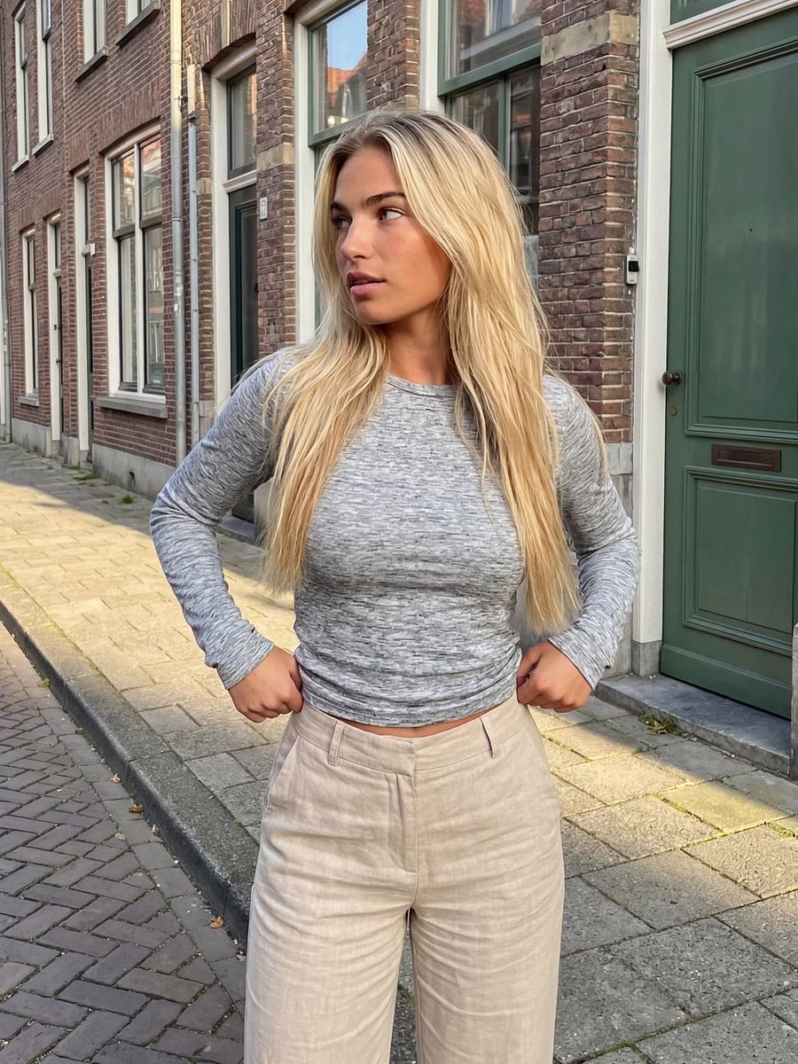
You give an AI image a cinematic look by setting warm against cool: warm tones (orange, gold) on your subject and cool tones (teal, blue) in the background, so your subject separates from its surroundings. This warm-cool contrast is the basis of the well-known "teal and orange" look from film. Below you will read how to steer it deliberately in your prompt.
What is warm and cool color contrast?
Warm-cool color contrast means placing warm and cool colors side by side that sit opposite each other on the color wheel. Such colors are called complementary: they sit directly across from one another, 180° apart, and together they produce the strongest possible color contrast (according to the Interaction Design Foundation). Orange and teal (blue-green) land close to that pairing, which is exactly why the two show up together so often.
Want a softer contrast? Then pick a split-complementary scheme: instead of the exact opposite color, you take its two neighbors, roughly 30° on each side. The contrast stays, but it reads calmer.
Why teal and orange look so cinematic
Teal and orange work so well because human skin tones fall in the orange-yellow range. Cool the background toward teal and your subject separates from its surroundings on its own, pushing the skin forward. Other complementary pairs, like green and purple, make skin look unnatural instead.
This look has dominated Hollywood blockbusters since the early 2000s (according to Adobe and PetaPixel, among others). It also mimics golden hour: warm light on the subject, cooler shadows and sky around it. That is a combination your eye instantly reads as "cinematic".
How to steer the contrast in your prompt
Describe warm and cool separately, and say where each color sits. Otherwise the model picks a dominant color itself, and you lose the contrast.
- Name the palette direction explicitly: "teal and orange color grade" or "warm key light, cool background".
- Put warm on your subject: "warm golden light on her face and skin".
- Put cool in the surroundings: "cool teal shadows and background".
- Tie it to a source (motivated light): a window, street lamp or neon gives the light a believable origin.
- Want it more precise? Name color temperature: a warm key light around 3200K against cooler ambient light around 5600K.
Unsure how to phrase it? The prompt generator turns your idea into a complete prompt with light and color built in. Then generate in the photo generator.
Warm and cool in AI video
Keep the palette consistent across the whole clip, otherwise the color "shifts" between frames and the cinematic look falls apart. Describe the warm-cool split in your video prompt just as explicitly as in a photo, and keep the light source the same. In the video generator you can reuse the same description you used for your photo, so a series fits together.
What to watch out for
Overdo the contrast and skin turns orange while everything else goes toxic green. Keep the skin natural and let the cool live only in the background and the shadows. Watch out for color bleeding too: a strong color can spread across the whole scene. So tie a color to one place ("teal only in the background") instead of naming it loosely.
Frequently asked questions
What is the difference between teal-and-orange and plain color contrast?
Teal-and-orange is a specific form of warm-cool contrast using near-complementary colors. It works so well because skin falls in the orange range and teal sits opposite it. Plain color contrast can be any color pair.
Should I name color temperature in my prompt?
You do not have to, but it helps. Terms like "warm 3200K key light" and "cool ambient" give the model a clear direction and make your result more predictable than "cinematic" alone.
Does this also work without people in the frame?
Yes. Warm-cool contrast works on any scene: warm light on your main subject, cool tones in the surroundings. For products or landscapes the same principle separates your subject from the background.
Ready to build your own cinematic look? Create an account and test warm-cool contrast on your next image.