2026-08-26
Negative space: how emptiness makes your AI subject pop
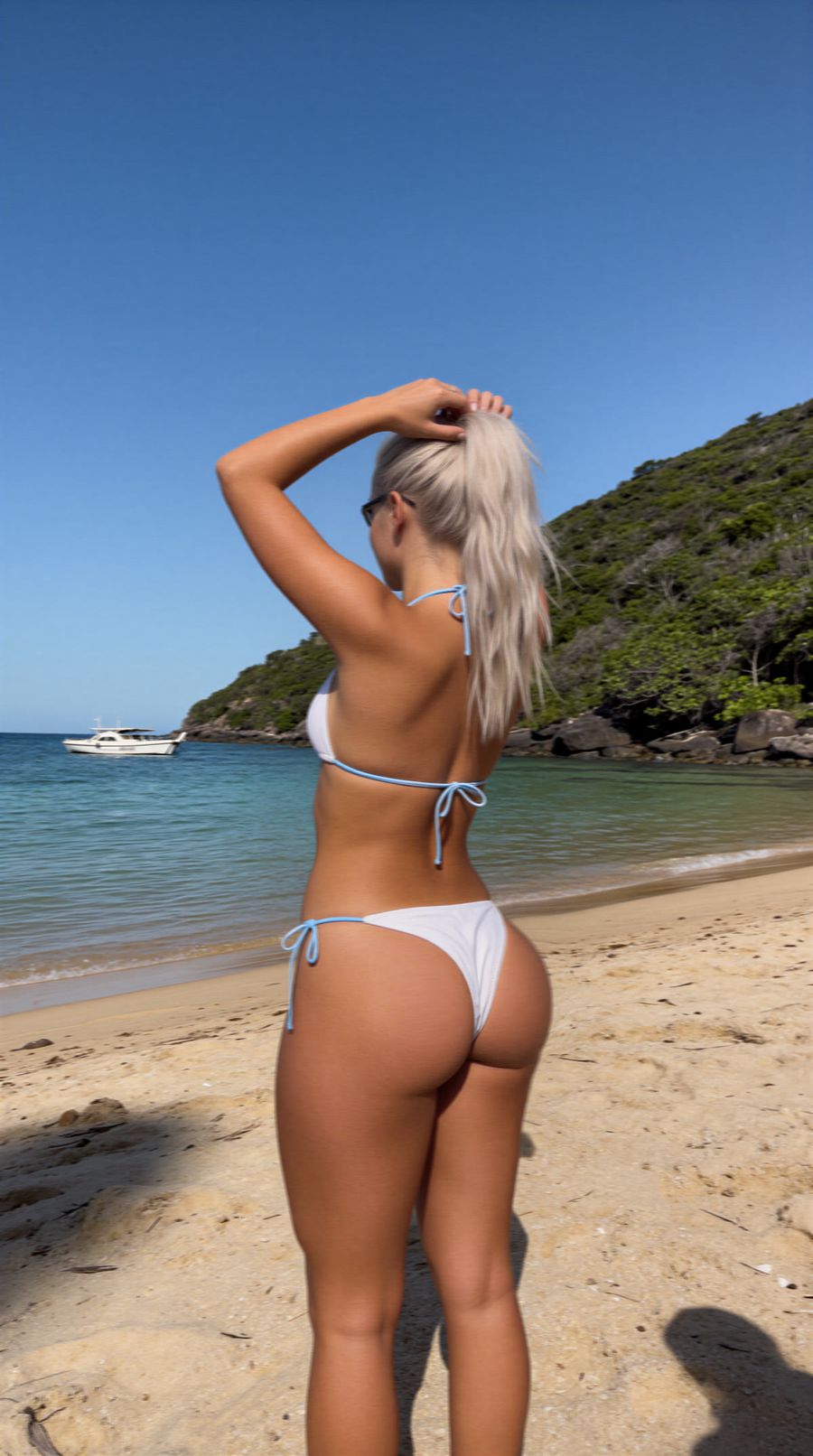
Negative space is the area you deliberately leave empty around your subject, and you use it to pull the eye toward that subject and make the image calmer and stronger. In AI photos it's one of the easiest ways to turn a busy, overcrowded result into something that reads instantly. You don't fill the frame with more detail, you fill it with air.
What exactly is negative space?
Negative space is the part of your photo that isn't your subject: the sky, a smooth wall, a blurred background or an empty stretch of water. The subject itself is the positive space. As long as the empty part reads as one calm area and stays separate from your subject, it works as negative space.
It isn't about an empty photo, it's about a deliberate ratio. A common rule of thumb is to let negative space take up around 60 percent of the frame, so your subject sits small but clearly in view.
Why emptiness actually makes your subject stronger
Emptiness around your subject works because there's nowhere else for the eye to go. There's no competition, so the eye lands straight on the only thing in the frame. That makes an image calm, focused and often more premium-looking.
That matters a lot in a feed. On mobile, people spend an average of 1.7 seconds with a piece of content, versus 2.5 seconds on desktop, according to Meta research. In that fraction of a second your subject has to be readable right away. An image with plenty of negative space has one clear focal point, so it beats a full, cluttered frame where the viewer has to search first.
Negative space also leaves room for text. Keep a corner or an edge empty and you can drop a title, logo or caption there later without covering your subject.
How to steer negative space in your prompt
Ask for it explicitly. Models tend to fill a frame by default, so name the emptiness as a wanted element instead of hoping it happens on its own. Terms that work:
- "negative space" or "minimalist composition"
- "subject small in frame, lots of empty space around it"
- "plain background", "open sky", "empty water surface", "smooth wall"
- "shallow depth of field" to turn the background into one calm, blurred area
If you want more control over placement, describe where the subject sits and which part stays empty. "Subject in the left third, empty sky filling the right half" steers more precisely than just "off-center". That ties into the rule of thirds: put your subject on one of the intersection points and let the rest breathe.
Not sure how to phrase it cleanly? The prompt generator turns your rough idea into a prompt with scene, composition and camera angle built in.
Common mistakes with negative space
Most misses happen because the empty area isn't really empty. Watch for these three:
- Subject too central. Dead center drains the tension from the image. Place the subject off-center on purpose, so the space beside it does some work.
- Busy "empty" background. A background full of clouds, branches or noise isn't negative space. Choose a plain sky, wall or blurred area, or soften the background with a shallow depth of field.
- Too much emptiness with no purpose. If the subject drowns, the ratio is off. Keep your subject small but clearly recognizable, not hidden away.
When in doubt, generate two versions, one strictly minimalist and one slightly fuller, and choose afterward. Because you pay per render, testing like that costs little.
Frequently asked questions
What's the difference between negative and positive space?
Positive space is your subject, negative space is the empty area around it. Together they set the balance of your composition: the more negative space, the calmer and more focused the image.
How much negative space should I use?
There's no fixed rule, but many creators keep around 60 percent empty as a starting point. For a calm, minimalist look you can use more, for a fuller story less.
Does negative space work in vertical video too?
Yes. Deliberately keep empty space above or beside your subject, so platform overlays like buttons and captions don't cover it and there's room for text.
Which aspect ratio works best?
Any ratio can work, but a wider frame helps. A landscape or square image gives you more room to let the emptiness breathe, while 9:16 works best when you place the empty space above or below your subject.
Negative space is the cheapest way to make an AI photo look more professional: you don't add anything, you leave things out. Create an account and test in the photo generator how much stronger your subject gets with a little air around it.