2026-09-25
A Film Look in Your AI Photos: Stock, Grain, Halation
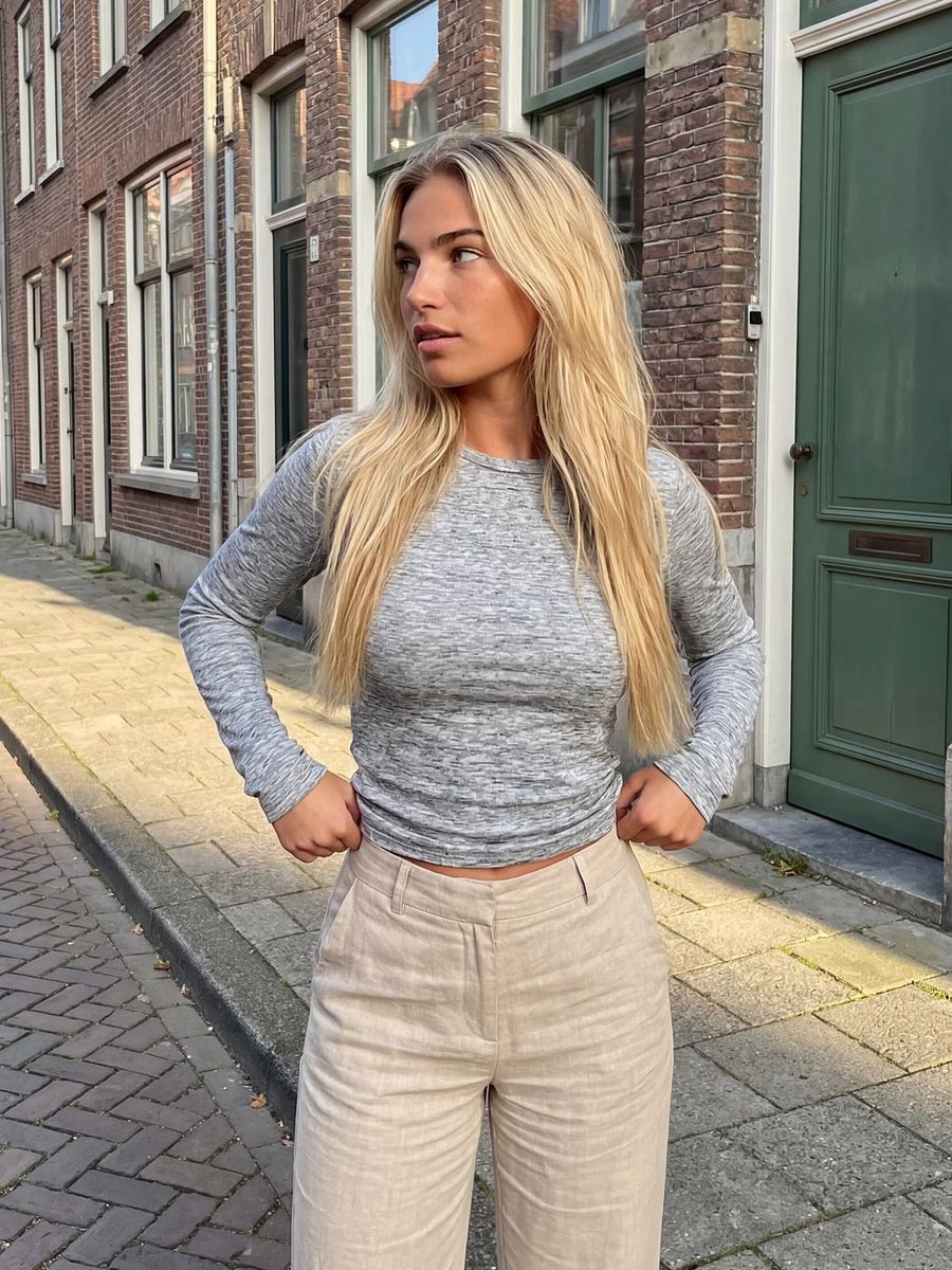
You create a believable film look in your AI photo not with the word "vintage", but by naming the concrete traits of a film stock: the color rendering, the contrast, the grain and the halation. Models know "vintage" as a vague pile of clichés (sepia, light leaks, a date stamp), while "analog film" is something specific. Describe which film you are emulating and which traits come with it, and your image starts to look like a scan of a negative instead of a filter.
What is a film look, and how does it differ from color grading?
A film look is the emulation of the complete character of a physical roll of film: the color science, the contrast curve, the grain and the halation together. That is different from color grading, where you choose a color style yourself. With a film look you aim at an existing, recognizable recipe, for example the soft warm skin tones of Kodak Portra or the gritty, desaturated look of bleach bypass.
So you are not steering toward "nice colors", but toward "this is how this film reacts to light". That makes the task more concrete and the result more consistent, because you are describing an existing reference point instead of a taste.
Name the film stock, not just "film"
The quickest win is naming a concrete film stock along with its traits. Kodak Portra 400, for instance, is a color negative rated ISO 400, with fine grain thanks to Kodak's T-GRAIN emulsion and warm, natural skin tones with a slight bias toward magenta (source: Kodak datasheet). Put that in your prompt as: shot on Kodak Portra 400, warm natural skin tones, fine grain, soft contrast.
A model name on its own does little, because the model may barely know the name. The traits behind it steer the image:
- Warm portrait film → soft skin tones, low contrast, fine grain.
- Tungsten night film (think CineStill 800T, ISO 800) → cool shadows, warm lamps, visible halation around light sources.
- Gritty reportage look → high contrast, desaturated, coarser grain.
Name the stock and the traits together, so the model has something to hold on to even when the name is unfamiliar.
The four building blocks: color, contrast, grain and halation
Every film look breaks down into four dials you can name separately. That gives you more control than one catch-all word.
- Color and temperature. Describe the film's bias: warm skin tones, cool shadows, a slight shift toward green or yellow. This is the core of why Portra reads differently from a clinical digital photo.
- Contrast. Portrait film often has soft, low contrast with open shadows; a reportage look leans on hard contrast. Say it explicitly, because models like to default to punchy contrast.
- Grain. Ask for "fine film grain", not "noise". Grain is the silver structure of the film and reads as organic; digital noise reads as dirty. More sensitive film (higher ISO) means coarser grain.
- Halation. This is the detail that gives an image away as film: a soft red-orange glow around bright lights. It happens when strong light passes through the emulsion and reflects off the film base back onto the red-sensitive layer, re-exposing it (source: analog.cafe, Lomography). Films with an anti-halation layer suppress it; stocks without that layer, such as CineStill, are known for that red glow. Ask for "subtle red halation around the highlights" for a nighttime, neon-lit look.
Bleach bypass and other signature looks
Bleach bypass (also called silver retention or skip bleach) is a classic film look where you skip the bleach step in development, so the silver stays in the emulsion. The result is more contrast, coarser grain and clearly less saturation: a gritty, almost black-and-white color photo. The look became famous in Se7en (1995, cinematographer Darius Khondji) and Saving Private Ryan (1998, cinematographer Janusz Kamiński) (source: Wikipedia, bleach bypass).
In your prompt you translate that into concrete words: bleach bypass look, desaturated, high contrast, retained silver, coarse grain, gritty. That summons a specific, recognizable style instead of a generic "dark mood". If you do not know the film name or the process, simply describe the effect: desaturated, hard contrast, grainy.
Keeping a film look consistent across a series
If you want the same film look across several images, reuse the exact same block of text about stock, color, contrast, grain and halation in every prompt. Models drift slightly in color and contrast from render to render, so a fixed description is your anchor.
Once the look works, you keep it stable in two ways. Use a successful film image as a reference in image-to-image with a low amount of change, so new images inherit the same tone. Or match a whole series afterward with the same edit. That last step is essentially color grading on top of your film look: emulate the stock while generating, then even out the series.
Frequently asked questions
What is the difference between a film look and color grading?
A film look emulates the complete character of a physical roll of film (color, contrast, grain and halation together), while color grading is a color style you choose and can apply anywhere. You can combine them: emulate the film first, then match the color.
Why does my "vintage" prompt look fake?
Because "vintage" is a catch-all: the model guesses at sepia, light leaks and heavy filters instead of one specific film. Name a concrete stock and the four building blocks (color, contrast, grain, halation) and you get a focused, believable look.
What is halation and how do I summon it?
Halation is the soft red-orange glow around bright light sources, caused by light reflecting off the film base back onto the red-sensitive layer. Ask your prompt for "subtle red halation around the highlights", especially for night and neon images.
Which film stock should I pick for portraits?
For warm, forgiving skin tones a portrait negative like Kodak Portra 400 is a safe choice: fine grain, soft contrast and natural colors. For a gritty, dramatic look, pick bleach bypass or a coarser, high-contrast film instead.
A film look ultimately comes down to naming exactly what you want, and that takes a few test renders to dial in. Because you pay per render, you can cheaply try a few stocks and settings side by side before picking a winner. Create an account and test your first film look in the photo generator.