2026-09-24
Color grading: one look across your AI images
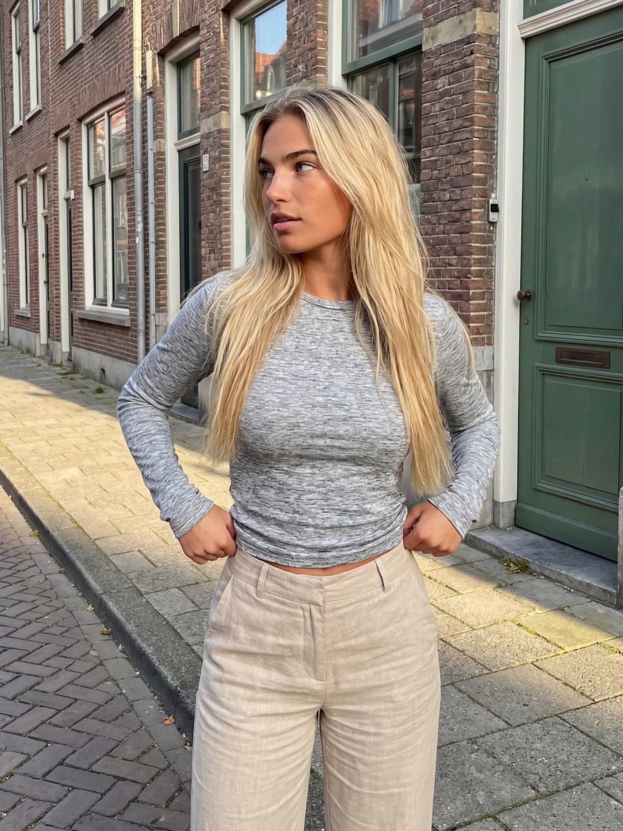
A consistent color look, or color grade, is the shared color tone and contrast that make all your images read as one coherent set. In AI you steer it two ways: you name the look explicitly in your prompt, and you use a graded reference image as a color anchor for image-to-image. This is nothing new in film. When the digital intermediate took over, it went from roughly half of Hollywood films in 2005 to about 70% by mid-2007, and that shift is exactly what made recognizable looks like teal-and-orange easy to pull off.
What is a color grade, and what is a LUT?
A color grade is the deliberate color style you lay over an image, separate from ordinary color correction (fixing white balance and exposure). Correction makes the image neutral and accurate; grading gives it a mood.
Colorists often save a look as a LUT (look-up table): a conversion table that maps every input color to a desired output color, so you can apply the exact same grade to a hundred images. There are creative LUTs for an artistic look and film-emulation LUTs that mimic a specific film stock. You don't have to use them, but they explain why a fixed look is the core of a recognizable style.
Why a consistent color look makes your feed stronger
A fixed color look makes your content recognizable before anyone reads your name. On a busy feed people scroll by pattern, and a shared tone is one of those patterns.
Consistency is not just cosmetic, either. Consistent brand presentation is linked to meaningfully higher revenue: the well-known Lucidpress research landed at around 23% (later revised to 33% in its 2019 edition). The exact figures vary by report, but the direction is clear: coherence pays off.
A look also picks a side. Skin tones are naturally warm, so pushing shadows toward cool (teal) automatically creates contrast that separates people from their surroundings. That is precisely why teal-and-orange became such a persistent blockbuster look.
How do you steer a color look in your prompt?
Name the colors and the contrast concretely instead of "nice colors." Vague wording lets the model fall back on its average, and that's never your look. Put the look phrase up front and repeat it in every render.
- Tone and temperature: "warm golden tones", "cool teal shadows, warm highlights", "muted earthy palette", "soft pastel colours".
- Contrast and black point: "high contrast", "lifted matte blacks, faded film look", "deep crushed blacks, punchy contrast".
- Saturation: "desaturated, low saturation" or, the other way, "rich saturated colours".
- Film emulation: "Kodak Portra look", "bleach bypass", "cross-processed film" summon a whole color style in one term.
Not sure how to phrase a look cleanly? Let the prompt generator turn your description into a structured prompt with color, light and contrast built in.
A reference image as your color anchor
The most reliable way to steer a color look is with an example image rather than words. Upload an image with the grade you want as a reference in the photo generator and work with image-to-image, so the color and tone carry over into your new scene.
Keep the amount of change (denoising) low enough to hold the look, but high enough to render your new subject. Want a whole series in the same style? Use the same reference image as your anchor each time. That keeps your color from drifting per render, which happens quickly with text alone.
Grade in the prompt or afterwards?
The prompt gets you a long way, but the last bit of coherence is often locked in afterwards. AI models vary from render to render, so even with identical prompt words the color shifts subtly between images. One light, identical color adjustment across the whole set (or the same LUT) pulls them together seamlessly.
Bake the grade into generation when you're making content fast and the look doesn't need to be extreme. Grade afterwards when you want a precise, repeatable style across many images. Either way it saves renders: you're steering deliberately toward the look instead of endlessly re-rolling.
Frequently asked questions
What is the difference between color grading and color correction?
Color correction makes an image neutral and technically accurate: white is white, the exposure is right. Color grading adds a deliberate mood and color style on top. Correction is the foundation, grading is your signature.
How do I keep the same look across a whole series?
Use one fixed reference image as a color anchor for image-to-image and repeat the same look words in every prompt. For the final coherence, lay an identical color adjustment or LUT over the whole set.
Does a color look work in AI video too?
Yes. You describe the grade in your video prompt or grow your clips from already-graded starting frames, so the video inherits the same tone as your photos. Just note that color can shift after upload due to color space and gamma.
Do I need to buy expensive LUT packs?
No. A LUT is handy when you work in an editor, but for AI content you get far with a well-described look and a consistent reference image. Start there and only buy something once you want a very specific film look.
A recognizable color style is one of the cheapest ways to make your content look professional. Create an account and test a fixed look across your first set of images.