2026-08-12
A/B test your thumbnail: why one cover isn't enough
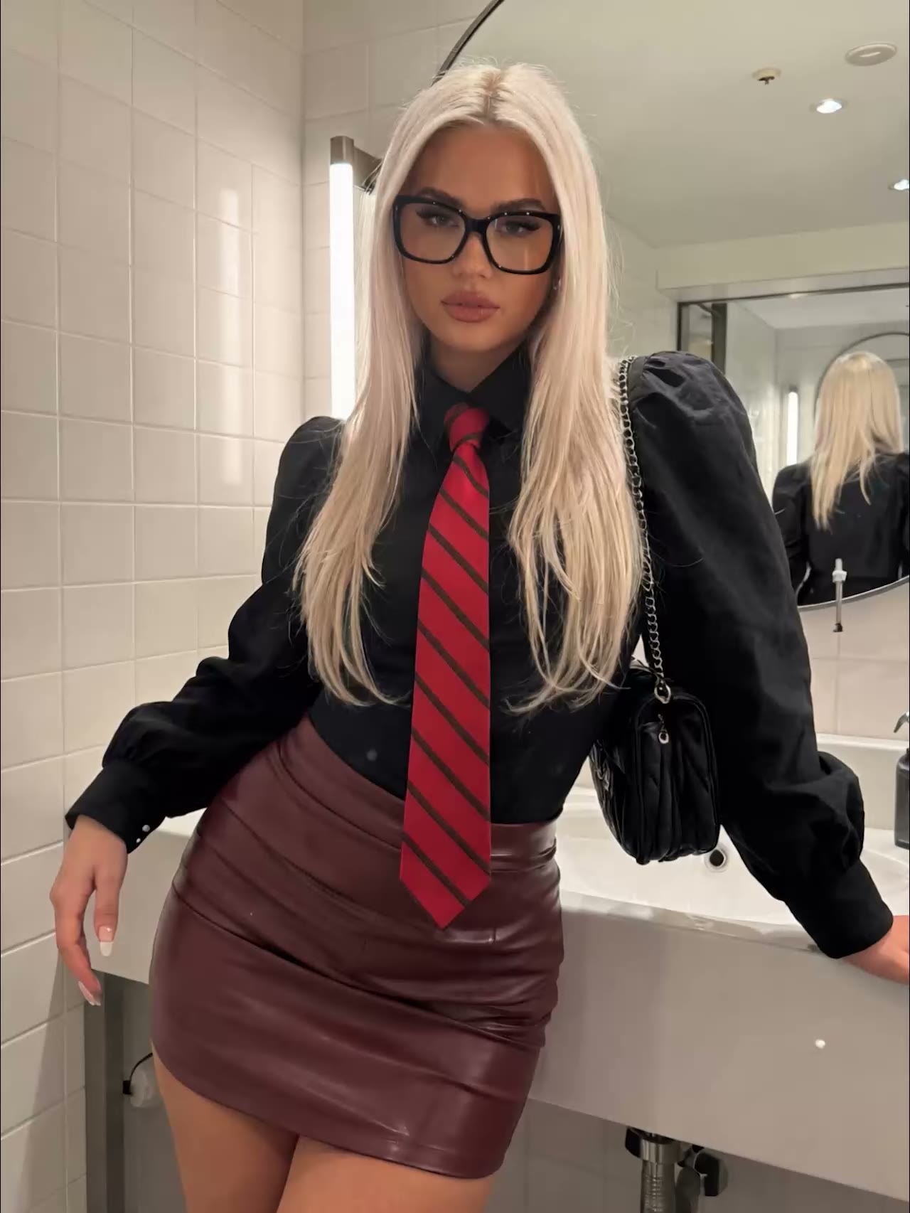
Never make just one thumbnail: generate several versions of your cover, test them against each other and let the view numbers decide which one wins. That's the only reliable way to know which image people actually click, because your own favourite surprisingly often isn't it. According to YouTube, 90% of the best-performing videos have a custom thumbnail (YouTube Help), and the creators who consistently outperform don't pick that thumbnail on instinct, but on the basis of a test.
Why one thumbnail is really a gamble
Making a single thumbnail means you're betting on what works without ever checking whether you were right. You're too close to your own content: the detail you find striking often means nothing to a cold scroller. A test replaces that opinion with data.
Even a small difference in crop or facial expression shifts the click count noticeably. That's exactly why YouTube built a thumbnail test into Studio: if the platform itself measures this, it's naive to assume you know the winner in advance.
Change one thing per variant
Test variants that differ on exactly one point, otherwise you'll never know what made the difference. Swap just one dial per version:
- Framing: a close-up of the face versus a medium shot.
- Expression: a neutral look versus a pronounced emotion.
- Text: with or without a word on screen, or a different word.
- Background: busy and detailed versus a clean, cut-out subject.
- Colour accent: warm versus cool, or a bold contrasting block behind your subject.
Change three things at once and the new version scores better, and you still don't know why, so you can't repeat the win in your next post. One variable per test keeps your takeaways usable.
How to generate several covers cheaply
Making multiple variants doesn't have to cost much when you pay per render instead of a subscription. A few practical routes:
- Image-to-image in the photo generator: take your strongest image and generate variants with a different crop, expression or lighting mood, keeping the same person.
- A batch of variants via the prompt generator: have it write several prompts on the same theme at once, so your covers stay close together but each is slightly different.
- Background removal: cut out your subject and place a clean, high-contrast block behind it so it stands out in a crowded feed.
Because you only pay for the renders you actually make, a set of three or four test covers costs you little. You don't need a fixed monthly fee to be allowed to experiment, and a variant that flops isn't wasted subscription money.
How to actually test them
On YouTube you test thumbnails directly in Studio; on other platforms you do it by hand. The built-in "Test & Compare" feature has been rolling out to all channels since 2024: you upload up to three thumbnails, YouTube shows them to viewers at random and, after about two weeks, names a winner based on "watch time share", the share of watch time each version generates (Search Engine Journal).
For Instagram, TikTok or a blog there's no such button. There you approach it manually:
- Post comparable content with a different cover at comparable times and compare the click and view numbers.
- Show two versions to a small test group or via a story poll before you commit.
- Swap the cover after a set period and see whether the new version does better.
This approach is less clean than a true A/B test, but still beats choosing blindly and never looking back.
What every winning thumbnail has in common
The thumbnails that win tests are almost always the clearest, not the most detailed. So don't test random images against each other, but variants that are each already readable.
- Readable at small sizes: most people see your cover as a tiny tile on a phone. YouTube advises making your thumbnail as large as possible and, if you add text, choosing an easy-to-read font (YouTube Help).
- One focal point: a single face, object or word that catches the eye, not five things fighting for attention.
- High contrast and recognisable emotion: a clear subject against a calm background almost always works better than a busy image. Colour draws the eye, but too much overwhelms it.
In short: start with covers that are already strong on their own, and let the test decide which of those strong options performs just a bit better.
Frequently asked questions
How many thumbnails should I test?
Two to three is a good start. YouTube's own Test & Compare lets you pit up to three versions against each other. More variants means viewers get split further, so you wait longer for a reliable result.
Can I also A/B test on Instagram or TikTok?
Those platforms don't have a built-in thumbnail test like YouTube. You approximate it manually: post the same content with a different cover at comparable times, or let a small test group choose, and then compare the view and click numbers.
What does YouTube use to pick the winning thumbnail?
"Watch time share": the thumbnail that generates the largest share of watch time over the test period. The test runs about two weeks and the winner is then set automatically, unless you pick a different one yourself.
Isn't making several covers expensive?
Not when you pay per render. You generate a few variants, pay only for those images and don't need a subscription. A test cover that gets dropped costs you little, while the winner pays for itself in extra clicks.
The cheapest way to improve your click numbers is to stop guessing. Create an account, generate three versions of your next cover in the photo generator and let your audience pick the winner. You pay per render, no subscription, so testing costs you only a few cheap images.